This past September while at the Great Wisconsin Quilt show, I had some time to visit the vendors. I was especially intrigued by all the gradation fabrics I found there since I presented 3 lectures on the topic.


I was fascinated by this table topper hanging in one of the booths. It was made out of circles from a gradation fabric (it was orange, so I was immediately drawn in).

The owner of the booth told me it was a Cheryl Phillips pattern, but they didn’t have it available. Hmm, that name sounded familiar. So I did a search and found Cheryl’s site (click here to visit for yourself).

And on the site I found her Bonus Blossom pattern which was used to create the pretty topper.

So why did her name sound familiar? As I scrolled through her site I realized the “Phoenix” quilt I helped Renee put together a few years ago was Cheryl’s pattern. Here’s Renee’s quilt top and you can click here to read the story. I think Cheryl Phillips loves gradations as much as I do!

I recently shared my Gradation lecture and workshop with a guild in Eagle River, WI. The Cranberry Quilters are a delightful group, and we had so much fun playing with gradation fabrics that I couldn’t resist pulling out one of mine, while unpacking after the trip, and planning a Bonus Blossom topper for myself.

I took the fabric along on retreat the following week and cut 6 red/orange circles from one stripe, and 6 purple/blue/green circles from another. I sewed 1 circle of each, right sides together with a circle of thin batting, turned it right side out and repeated to make 6 turned circles. Then I used a faux cathedral window technique to sew the circles together. Here’s the back of my topper.

Once all my circles were connected I realized that I wasn’t consistent when I lined up the front and back fabrics. Do you see the problem? Here’s the front:

I think it’s really pretty, but it’s not consistent. I kept the greens along the outside edge on the front, while half the back circles have the orange on the outer edge and the other half ~ the dark red. It may not be consistent, but I’m choosing love my very original design. I’m certainly not going to take all those circles apart! The batting caused a bit of puckering on the front, but I’m choosing to think it adds to the blossom effect 🤣. I do love the way the hot colored gradation plays with the cool one. I’m not sure if I’ll use it as a table topper or hang it on the wall. Hmm.
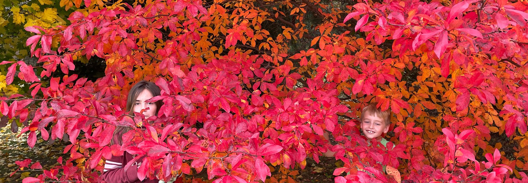
A few days after I arrived home from retreat the grandkids came over. Mike came in from outside and told us we had to come out and see a tree in our yard. Amazing colors! The kids wanted to jump right in. It looks like a gradation tree to me!

Two days later the leaves were all on the ground. Glad we captured this colorful moment.


Debbie H. says
Hi Chris…..Here’s a thought….why not use the back of it as the front and applique the complimentary wedges onto it? Love the beautiful foliage on your tree and your precious grandkiddos ;-). Thanks for this great post!
Judy says
Inspiration as usual. Have a great day!
Mona Epley Baker says
Chris: I think your gradated topper looks more natural with the leaves not being matchy matchy! Love your blog…and was so impressed by your lecture and class for the Western Wisconsin Indianhead ASG Chapter earlier this year. Thanks for continuing to teach and inspire!
kim holt says
I would sew leaves on the other side and make it reversible. Then you could use it for 2 seasons that way. I love you blog always find a new trick to try. You are so creative.