• Skip to main content
  • Skip to primary sidebar
  • Skip to footer

  • Home
  • About
  • Gallery
  • Classes
  • Trips
  • Books
  • Blog
  • Contact
  • Sign Up For My Blog

Blog

Shot Cotton and the Magnifier App for Photos

October 10, 2021 5 Comments

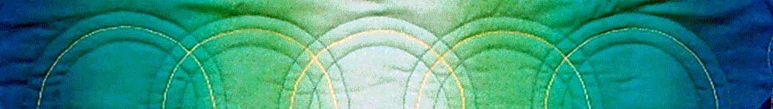
Back when we used to be able to wander through quilt shows, I found myself drawn to a special type of quilting fabric – it’s called Shot Cotton, and it’s the “green” fabric I used in my nephew Josiah’s quilt.

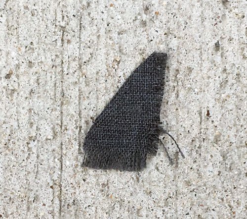
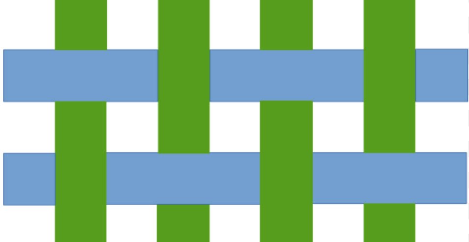
Most of the cotton fabrics quilters use begin as a white fabric that is dyed or printed to make all the beautiful bolts we are so infatuated with. However, Shot cotton is special because the warp and weft yarns are 2 different colors woven together to create a special depth, a “shot” of color. When the edge of this fabric ravels, you can see a bright contrast to the body of the fabric.”

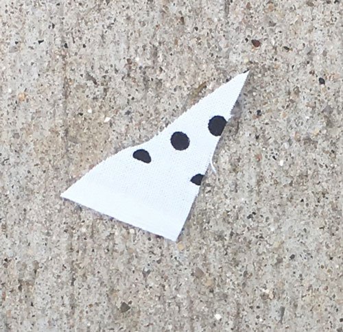
These fabrics are woven using cotton thread which is dyed in small batches. Variations in color and small imperfections in the weaving are a natural part of the process. Here’s an even closer view:

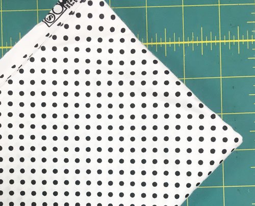
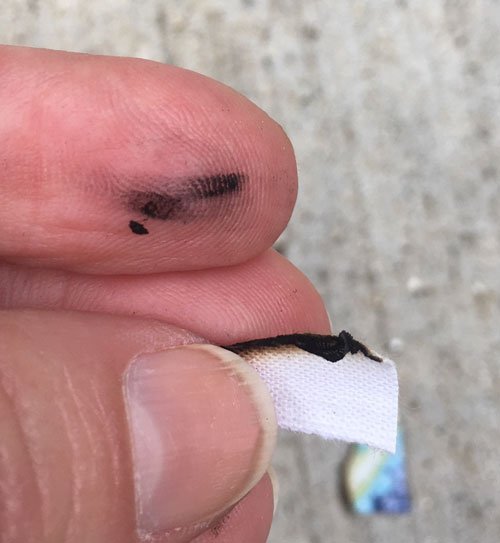
The really exciting part for me in learning more about shot cottons, was learning how to get a really close up “shot” with my iphone. After a bit of searching the internet I discovered that my phone has a magnifier app.

and I can take photographs in that app. This is a close up of my necklace as seen in the magnifier app:

By sliding the yellow dot I’m able to achieve a very good magnification and… by touching the “X” I can take a photo of the image and save it to Photos. We’re always learning 😊!

Back to the shot cottons. They actually do have a bit of a sheen and the colors are beautiful. Have you worked with them? Do you have any in your stash? Perhaps you don’t even realize it.

We tend to buy the fabrics that tickle our fancy and often we don’t even know about these interesting details. I hope you found it as interesting as I did.

Gradation Borders

December 8, 2019 1 Comment

The inspiration for this week’s post came from a wonderful event I attended last night called the “On Wisconsin Fiber Arts Biennial”. Every other year the Wisconsin Museum of Quilts and Fiber Arts holds this exhibit to showcase pieces from fiber artists throughout our State. The opening reception was a lovely opportunity to get a first look at this visual feast!

The piece I have on display is the 3D box I made for the ThreadBenders challenge. I posted about this in September (click here to read that post). We decided to each enter our boxes in the biennial as a group, and here they are:

I was honored to be a part of the photograph taken of all the artists in attendance:

Mike and I spent a lovely couple of hours enjoying beautiful downtown Cedarburg, in it’s Christmas finery, before attending the museum reception. I highly recommend exploring Cedarburg and visiting this fascinating exhibit.

So what does this have to do with borders? Well, I met up with Jackie while enjoying the exhibit and she had made a “slice” of the building quilts featured in the photograph at the beginning of this post. As we talked she said she heard me give my Gradation Play lecture at the Sheboygan Quilters guild. Afterwards she was inspired to purchase some gradation fabrics, and wasn’t sure what to do with them. I mentioned a great place to use these fabrics is in borders, and on the way home I decided it was a good idea to share.

A single border of a gradation fabric can add a lot of interest without taking away from the center of the quilt.

Curved Path Pizazz by Chris Lynn Kirsch

I especially loved using a gradation border in How Beautiful – Liberty (to read a post about this quilt click here):

In this next full size quilt top I struggled to find a border that would work. I searched through my stash and was quite frustrated until I found a black to white pointillist gradation.

In the first two borders the gradation ran perpendicular to the edge of the quilt top. In the third one it ran parallel. It’s a good idea to try it both ways.

In the next quilt I appliquéd circles cut from the background fabric onto a black border.

There are so many ways to use gradation or Ombré fabrics, and placing them in borders is one of my favorites. If you’re working on a Christmas project that needs a quick and effective border… this may be the answer ?.

African Fabrics

August 25, 2019 8 Comments

My nephew Kevin and his wife Alex spent the first 2 1/2 years of their married life in Africa with the Peace Corps. When they returned home they brought me a very special gift – fabric! I was overjoyed at their thoughtfulness. This is a photo of 4 of the pieces I received, along the selvedges. Aren’t the colors delicious!?!

They married shortly before they left for Africa and now that they’re back we have the privilege of celebrating their marriage with them in November. We had a shower for Alex yesterday and as of Thursday I still wasn’t sure what I would get her. Then it hit me. I’ve been having a lot of fun with a new product line called “Quilt As You Go” by June Tailor™. They actually print the pattern onto batting and it makes the process simple and fun. One of their placemat lines would be perfect!

I’ll be doing a blog post about their products in the near future, but for now just know that it made a last minute project a breeze. This is the piece of fabric I chose to use:

And this is the project package insert with a few additional fabrics:

It may not be clear from the photograph, but the center area of the placemat in the pattern picture shows it being pieced on the diagonal in yellow fabrics. I took advantage of the stripes in the African fabric and cut the center section on the diagonal to get the same look. Next I quilted on the lines of the fabric before adding the side borders – quilt as you go!

The project took me 1 1/2 hours from cutting to binding. What fun!

I couldn’t resist “signing” both placemats with my initials and the year, in the lower right corner:

It was a fun way to repay their thoughtfulness to me – and a unique gift. But, it still wasn’t quite enough, so I searched through my cupboard to find a candy dish of my grandmother’s. Now I was happy. And, from the look on Alex’s face, I think she likes them (as you can see, I used a different African fabric on the back – making them reversible.

If you’d like to learn more about a variety of quilt as you go techniques I’ll be doing a lecture on this very topic at the Madison Quilt Expo, September 5-7.

It’s called You Can Quilt As You Go and I’ll talk about the June Tailor products, as well as many other tips and techniques for doing things quilt as you go.

I will also be doing a 3 hour workshop on Friday entitled Road Block Removal.

This is a workshop for quilters who struggle with trying to decide how to quilt their quilts. I begin the class by sharing a trunk show of quilts displaying many different ways to quilt them, by hand and machine. Then we gather in a circle and I invite the students to throw the unfinished quilt tops they’ve brought in on the floor. Everyone in the group brainstorms how to quilt each one.

To register for my class and/or see all the other offerings click here. The Expo is also looking for volunteers and they asked me to share this:

It’s a wonderful show – it’s coming soon – and I hope to see you there!

Burning Fabric

July 8, 2018 7 Comments

Why would anyone want to burn fabric?

Perhaps a better question is: have you ever wondered if a fabric you want to use in a quilt is 100% cotton? There is an easy test to check. Many of you may already know this, but I’m hoping some of you will find this helpful.

Recently I was cleaning out the cupboard where I keep my quilt backing pieces and non-cotton fabrics. I found a piece of black and white polka dot fabric and wondered why it wasn’t in with the rest of my stash.

Perhaps it was a polyester blend. Nothing on the selvedge showed fiber content, so I grabbed a book of matches, cut off a corner of the yardage, and went outside.

I lit the pointy end with a match and watched it burn. I waited for it to cool, then I picked it up and when I rubbed it between my fingers, the residue was a soft ash.

This is the case for natural fibers such as cotton, rayon, linen, silk, etc.

For the sake of comparison I cut a triangle from a fabric I knew was a polyester.

The results? It melted.

You can see the light reflecting in the “plastic-like” burned semi-circle on the fabric, and the small black piece was stuck to the cement. Man made fabrics like polyester and nylon melt rather than ash.

The next day I pulled out some beautiful scraps I wanted to use in my next challenge quilt.

They were given to me by a woman I stayed with when I taught for a quilt guild in Eau Claire, WI. She told me there was a men’s necktie factory nearby and they sold their scraps by the pound. She then gifted me with a bag full.

Before I attempted to make them into appliqué shapes, I thought I’d better check to see if they were silk or polyester, because ties can be made from either. I’m happy to say they all passed the burn test and are silk:

The interesting thing was the ash was not as soft as the cotton fabric and it had a bit of a gritty feel when I rubbed it between my fingers. I guess I’ve never burned silk before because I was a little surprised by this.

Do any of you use this test for your fabrics? Any other thoughts you’d like to share  🙂 ?

A Spandex Quilt, part 2 – “40 Wonderful Years”

June 5, 2016 6 Comments

Welcome back to my spandex quilting adventure!

Sewing on this non-traditional fabric presented a number of problems. Not only did the copper spandex fabric show pin holes and drag when satin stitching with a walking foot, but I couldn’t find any way to mark it for quilting. I could mark on the black, but that wasn’t good enough.

Then the real problem came when I tried to free motion. It would go smoothly for a while, then the spandex would begin to drag and pucker under my hopping foot. What a DRAG!!! When free motioning, there is no way to place paper under the foot, as I did when satin stitching. What to do??? Well, I was able to do a lot of straight quilting first to anchor everything.

AD straight quilting

Next, I free motioned in the black fabric (where there was no drag).

Eureka!

Here’s the exciting part: the straight line grid quilting I’d already done framed in where the free motion quilting would go. So I flipped the quilt over and free motion quilted my spirals from the back. It worked great!

AD free mo from the back

Some areas were quilted heavily and others weren’t quilted at all. The effect was what I was hoping for, and here’s the finished quilt!

quilting with spandex

So Why is it called “40 Wonderful Years”? Well, when creating the design, I needed a focal point for the center. I wanted to use Art Deco lettering, as that was very popular during the Art Deco period. But what “word”? You may remember that my husband and I just celebrated a landmark anniversary (click here for that post). On our first date (in 1972), we went to dinner and a movie, and then we walked along Bradford beach on Lake Michigan in Milwaukee, and this romantic man drew our initials in the sand. I decided to return the compliment 🙂 !

I hope you enjoyed my spandex adventure. Any questions?

A Spandex Quilt

May 28, 2016 4 Comments

While at the Sister’s Quilt Show Expo in Oregon this past Summer, l happened upon the Babylok™ booth and was intrigued by a sample the rep had made using swimsuit material. Because the fabric was shiny and stretchy, the machine quilting was dimensional and dynamic. Then, on our way back to Portland, we stopped at a huge fabric store and I found a piece of metallic copper spandex knit – on a clearance rack! I went home with 2 yards.

AD copper spandex

When the Milwaukee Art Quilters chose “Art Deco” as their large challenge theme this year, I knew I had the fabric and the quilting idea, I just needed a design. I did a bit of web-surfing and found a site with instructions for creating “Great Gatsby Style Patterns” in Photoshop. (in case you’re interested it’s:  http://blog.spoongraphics.co.uk/tutorials/how-to-create-a-great-gatsby-style-art-deco-pattern).

After a bit of trial and error I chose a design. Next I made a few small stitching samples with a variety of different batts and stabilizers, so I could try stitching on this very non-traditional fabric and see what worked best.

quilting on spandex

I decided to create the quilt top using my Silhouette Appliqué technique:

  1. I drew my design, with a sliver of soap, onto a black cotton fabric,
  2. I then layered it on the copper spandex fabric, both right sides up. Next I placed this on the wool batting and stabilizer I had chosen. I pinned in areas where the black fabric would not be cut away, because the copper fabric shows pin marks.
  3. In black thread, I stitched on all the soap lines using a walking foot.
  4. The black fabric was cut away, close to the stitching, everywhere I wanted the copper to show.
  5. Next, all of the raw edges needed to be satin stitched. When satin stitching, the spandex would begin to drag under the toe of the machine foot while the toe on the black fabric moved fine. This sheering effect was not working at all, but I was able to slip a piece of paper under the spandex side of the machine foot and then it stitched quite well.

AD layered

Once the appliqué was done, I layered everything over a piece of flat cotton batt, and the quilt backing fabric, re-pinning in the black fabric areas once again.

Stay tuned, in my next post I’ll cover the trickiest part – the quilting!

Scraps, Value and “Beautiful Buts”

May 20, 2012 9 Comments

Thanks to everyone who responded to my survey about quilt classes a few weeks ago. It was interesting to see how many of you like scrap quilts and it got me thinking about a technique I developed for sorting my scraps by value. Value is the relative darkness/lightness of a fabric and it can make or break many quilt patterns. I came up with a value  sorting technique when I was making a quilt I called Almost Charming.

I had been in my guild’s 6″ square exchange and decided to use those squares  in the Friendship Star pattern and this ended up becoming a very popular class. A true charm quilt has only one piece of each fabric used. Because I cut each square into triangles, there are two pieces of each fabric and thus it is “Almost Charming”.

When sorting scraps for a quilt, some patterns require just lights and darks, with the mediums needing to be removed for the pattern to work. Other patterns need lights, darks and mediums, but if there isn’t a clear delineation between the values, the pattern can get lost. The Friendship Star uses darks in the stars, lights in the background (which becomes the diagonal lattice when the blocks are set together) and mediums in the remaining “on point squares at the corners of each 9 patch star block.

I grabbed a bunch of 6″ squares (even after making this quilt I still have a box full – I think they multiply in the dark like bunnies)

Step 1 – quickly and without any deep thinking, divide the fabrics into 2 piles: lights and darks (there are no wrong answers, so just do it)

2. Using the same quick method, take the dark pile and divide it into 2 piles: light and dark (remember value is relative to what’s being sorted)

3. Now do this for the original light pile.

4. Here’s the tricky part (remember not to overthink anything) – of the four piles before you, set the dark/darks and the light/lights aside. Now sort the medium/dark pile from step 2 into 2 piles: dark and light; and sort the medium/light pile from step 3 into 2 piles: dark and light. This will give you 4 medium piles.

5. By removing two of these piles there will be a definite difference between the darks, the mediums and the lights. The pile on the far left and the pile on the far right above need to be removed. The two center piles will be combined to form the “mediums”.

So here you have it all. The 3 piles along the bottom of the picture are the dark, medium and light piles. The 2 piles at the top of the picture are the ones set aside for use in a future quilt.

So what are “Beautiful Buts”?

I wish I remembered where I learned this expression, but the concept has stuck with me. There are some fabrics printed with an equal amount of dark and light in them. They are usually “beautiful – but” they are not dark, light or medium. They are Beautiful Buts and they often don’t work well in scrap quilts and will need to be set aside. Here are just a few:

I hope you found this helpful. Do you have any helpful tips for sorting by value?


Beautiful Enough to Use!

November 11, 2010 1 Comment

What great comments. I especially liked the expression “shopping your stash”. Thanks Cindy. I think many of us could make wonderful quilts without ever making a trip to the quilt shop.

I was very convicted by Pat’s challenge to use my Liberty fabrics and they’re hanging on the design wall now just waiting for the right idea to grab me. (this may happen after the holidays – we’ll see). 

While I was writing the “Too Beautiful” post I came to realize that I actually had reached the point a few years ago that when I buy a fabric I really love I allow myself to use it as inspiration for something new right away. The blendable, “tone on tones” go into the stash, but when the new, jaw dropper, makes my fingers start to itch I’ll often just ignore the guilt of that project I’m in the middle of (which isn’t as exciting as when it was first begun) and indulge in playing with the exciting stuff.

Another method I’ve found helpful lately is to put the new gorgeous stuff in the stash just until the next time I’m ready to take a new challenge or I need to come up with a new class project. Then I grab that inticing piece and allow it to be the impetous for this new endeavor. This usually helps to get the ball rolling. Picking out other fabrics to go with the exciting one is always such fun for me.

The only problem with this system is that the great fabrics from my “petting and not using” days are still in the stash. So, thanks to Pat, I’m going to focus on some past loves. Who knows, some of them may look great together.

Perhaps I should step away from the computer and fondle some fabric :-). Blessings, Chris

  • Page 1
  • Page 2
  • Go to Next Page »

Primary Sidebar

Archives

Recent Posts

  • London ~ and More
  • Designed For a Purpose
  • Squirrel Quilts and More
  • Vintage Appliquéd Arrows and More
  • Fascinating Tidbits

Recent Comments

  • Karen Ann Moore on London ~ and More
  • Cheryl McLean on London ~ and More
  • Sue Halpern on London ~ and More
  • judy raddatz on London ~ and More
  • Joanne Corrigan on London ~ and More

Categories

Footer

My Guide

Whatever you do, do your work heartily, as for the Lord rather than for men.

—  Colossians 3:23

Contact Chris!

  • Home
  • About
  • Gallery
  • Classes
  • Trips
  • Books
  • Blog
  • Contact
  • Sign Up For My Blog

Copyright © 2026 · Chris Quilts · Website by Adunate · Privacy Policy